


.svg.png)


Telling an interesting story about homelessness. In America, continuums of care are addressing the changing landscape by providing support.
View Prototype4 Weeks | October - November 2023
Individual Project
As a first project assignment, we were given a theme and a goal of designing an infographic that builds a compelling argument step by step. The story should have a specific focus like homelessness in a certain country, state, or city. to start I wanted to better understand how homelessness in the United States is being tackled. I also wanted to see if there were any positive spins on the story. Upon researching I discovered Continuums of Care and their ways of helping mend the homeless epidemic county by county. It was then I decided the infographic should highlight homelessness in the United States, feature continuums of care and highlight one state. Homeless youth also caught my eye as another area of opportunity for exploration.

Research
To better understand the topic and what the graphic should portray these exploration questions came to mind.
Resources
Many of the resources used were from government annual reports, and census data. I utilized reports and data from homeless departments as well as read different articles on the subject.

The first step was to understand out assigned client’s style, work and previous articles. Diving into the style guide and past work let me understand what tone authors typically write in as well.
Setting Up the Environment
Utilizing the information from the style guide, I set up the Illustrator environment with the correct specifications, point, fonts, and dimensions.
Outlining the article
The templates from the recreated style guid allowed me to set up an initial outline for the different charts/graphs.
.png)
.png)
After establishing a style guide for the project, I moved on to gathering the data and understanding its meaning. Gathering the data from different sources helped establish a better understanding of the overall situation. It also allowed me to get a better picture for how to shape the overall visualization narrative. I decided the first section would give an overview of homeless ness in the united state, the second would focus on homelessness in Florida and its’ continuums of care and the last section would tie into homeless youth in Florida.
Throughout the project duration, feedback was provided and each version provided new areas of improvement.
.png)
Version 1

Version one included many unfinished sections and outlines for the graphs. This version was overly formatted as it included space for a second page filled with 10 visualizations. At this time, I still did not fully understand the scope and where the data would lead so majority was left for styling. Many of the feedback for this included smaller font sizes, adding more graphics and figuring out what each visual would represent.
Version 2

This version was delivered around week 2. At this point I had a better understanding of the data and where I wanted the visualization to go. Timing however overtook this version as only 5 graphics finished. Feedback included stylistic lasy making sure each elements looked the same and the ones that needed to stand out should stand out. The graphic also included more text than was needed so I had to supplement that with more visuals.
Version 3

This version had the most time spent on the individual graphic styling. Taking in feedback from the previous version, I took more time making sure each graphic fit the economist style guide while also having the same font sizes, type faces. This week was where I also began including more graphics and planning out what other charts I wanted to include. By then I understood the three sections and was actively searching for better ways to tell the story while sticking to the style constraints.
Version 4

Before handing in the final version of the graphic, I decided to take a step back and analyze my latest version. By this point, many of the sections were coming together and I wanted to see where the visuals lacked. The florida map, and sections boxed in black were the main focus. This is where I understood what my current graphics represented and what was missing to finish telling the story. I also pointed out where my placeholder text was, as a reminder to finish editing. This was the only version not submitted for feedback.
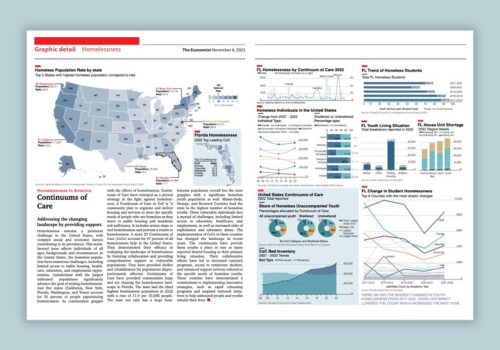
Final Draft

The final draft not only took the styling elements from the economist but also told the story in three parts. Each section detailed how homelessness was impacting the country, the support of the continuums and how Florida students specifically were impacted. Taking a step back in the version 4, really allowed a different perspective and helped me focus on not only what other visuals would be needed to enhance the message but deliver a mix of data.
Choropleth Map

I wanted to showcase the national state of homelessness in 2022 but also dive deep into the state of Florida. I chose to choropleth map to align to user’s mental models of the country where each state’s rate would have different colors on the 6 point scale. Matching the Florida map’s scale allowed users to differentiate and compare the overall country rates, including the national average with the county continuum of care rates. While the map itself gives a clear picture, I added the labels of the top 5 states to show case how population numbers differ from the rate. I believe adding DC in a different color showcased how, that state has a high rate but low population number compared to #1 California. The use of color as the primary encoding for the map but also the text styles shaped the graphic to deliver the intended message.
Bar Charts
To showcase one value a standerd bar chart was chosen. Utilizing length as the primary encoding depicted the differences for each variable change.

Stacked bar
Combo: Bar & Line chart
This combination of line and bar chart was meant to show the rate of homelessness in each continuum compared to the number of individuals. I utilized text to highlight the continuums with the highest rates and individuals. Size and color hue visually let the graphic take shape. Using the same color as the line but in a lower hue allowed the bars to be a secondary data catch. On a first glance, the intention was for users to look at the rate line.

Line Graph

Pie Chart
The pie chart was used as a visual narrative tool. The rest of the graphic contained similar visuals and as the only pie chart this would be a stand out graph for the Continuum of Car section. It was also used to compare the percentages of continuum of care location type in three different groups of unsheltered youth. Each pie chart section size allocation varied by youth type. Color was another encoding that helped distinguish each.
Stacked Area Chart
I wanted users to see the difference in the trends. The stacked area chart allowed me to visually desipc the change that occured in 2015. A standard line graph would not have been as rich of a visual tool. The color encoding along with area grab the reader’s attention to want to look deeper into the change and overall trend lines. The lines showcase the data points over time but the area emphasizes it.